We tested 11 small PDP changes.
#5 felt backwards until we saw the data. Most of them worked.
📆 Friday, 12 Jun 2026
Hi, and welcome back to Growth Espresso - your one-stop destination for everything e-com.
We've been testing CRO changes across DTC and beauty brands for a while now, and a handful of them keep winning over and over. Some are PDP-level, some are sitewide, but all of them are things you can go check on your own store this week.
1. Font size matters more than you’d think
We bumped a landing page’s body text from 16px to 20px on a whim, mostly just to see what would happen, and ended up with close to a 40% lift in conversion rate on cold traffic. We double-checked the numbers because it seemed too good to be true.
Thinking about it after the fact, it tracks. Most cold traffic is on mobile, scrolling fast, not committed to reading every word. Bigger text is just easier to process at a glance. If your audience skews older, this probably matters even more, somewhere in the 20-24px range.
Worth a look at your own PDPs and landing pages. If your body text is sitting at 14-16px, that’s an easy one to test.
2. Mobile collection pages in a single column quietly kill browsing
We noticed this almost by accident while checking a site on our own phones. If a collection page shows one product per row, you end up scrolling forever just to see what’s even on offer. Most people give up before they get anywhere.
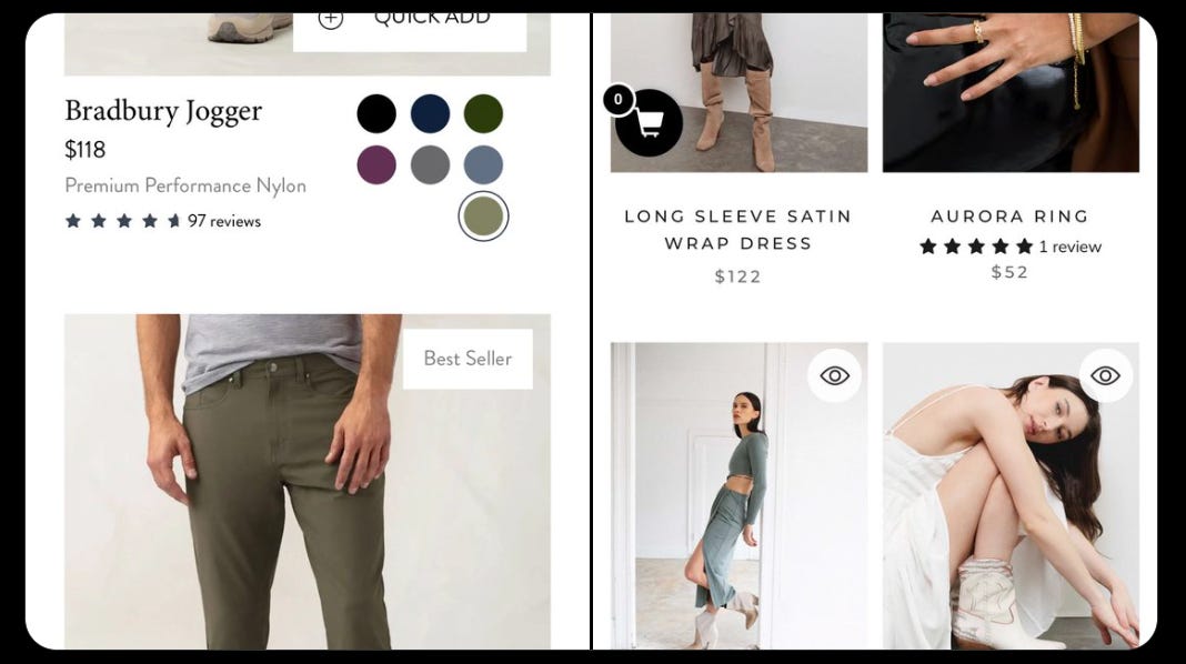
Switching to a 2x2 grid on mobile changed that pretty noticeably. Suddenly someone can see four products at once and actually compare instead of scroll-and-bounce. Feels like a small layout thing until you realize how much of your traffic is browsing collections on a phone.
3. The first PDP photo and second PDP photo seem to do different jobs
This one came out of looking at a bunch of PDPs side by side and trying to figure out why some “felt” clearer than others. The pattern that kept showing up was that the first photo’s only real job is letting someone instantly recognize what the product is, no mood, no lifestyle, just clarity.
Then for the second photo, swapping in UGC seemed to do more for trust than another studio shot would. Clarity first, then proof. We didn’t expect the order to matter this much, but it kept showing up.
4. One extra word in the product title moved the needle more than expected
This started as a “why not” test. “Rubber Sneaker” became “Supportive Rubber Sneaker,” “Weighted Blanket” became “Relaxing Weighted Blanket.” Small change, almost felt silly to test.
But across a few product lines, we kept seeing real lifts in PDP conversion just from that one word. Our best guess is that it gives people a tiny bit more to latch onto when they’re deciding if the product is “for them,” even before they read the full description.
5. Hiding bad reviews seemed to backfire
We went into this assuming a cleaner review section (mostly 4 and 5 stars) would help conversion, so we were a little surprised by what we found when looking at how people actually behave on PDPs.
People go looking for the 1 and 2-star reviews specifically. They want to know what could go wrong before they commit. A PDP with only glowing reviews can come across as curated, or even fake, while a few honest negative reviews, especially ones the brand responded to, seemed to build more trust than a perfect rating did.
Curious if your best-sellers have this problem? Reply with your PDP link and we'll take a quick look at how your reviews are set up.
6. Popup timing quietly affects more than just popup performance
We started looking into this because of a site speed complaint, not a conversion one. Turned out the popup firing immediately on page load was dragging down load times, which is its own problem. But it also seemed to be giving people an early reason to bounce before they’d seen anything.
A flat 3-second delay had a similar issue. What worked better was either tying the popup timing to the site’s average time on site (minus a few seconds), or switching to exit-intent only, so it shows up right when someone’s about to leave anyway.
7. Reusing a winning ad video on the landing page seemed to build instant familiarity
This one came from noticing that some landing pages just “felt” more trustworthy to cold traffic, and trying to figure out why. One pattern we found: if the exact UGC video that’s crushing it in ads also shows up somewhere on the landing page, people seem to recognize it, even if they couldn’t say why.
It’s a small thing, but going from an ad straight to a page that has that same familiar face on it seems to shortcut some of the “who even is this brand” hesitation.
8. “Fast shipping” beat “Free shipping” in every test we ran
We tested “FAST shipping” against “FREE shipping” on three different brands, mostly expecting free to win since that’s the usual advice. Fast won all three times.
If you’re shipping in 2-4 days, you’re already in “fast” territory, you might just not be saying it (if you’re dropshipping, this probably isn’t your test, no judgment). Our read is that free shipping has become so standard that it doesn’t register as a benefit anymore, while “fast” speaks to what people are actually anxious about, which is when the thing will show up.
9. Personalized shipping messaging felt different, even with the same offer
“Free shipping to Austin” versus plain “Free Shipping” is the same offer on paper, but it didn’t feel the same when we looked at it from a shopper’s perspective. The generic version is something everyone’s seen a hundred times. The localized one feels like it was written for that person specifically.
Setting this up takes a bit more work (geolocating users, we used the Google Maps API for this), but the personalization effect seemed worth the extra setup.
If geolocation setup sounds like more than you want to take on right now, reply with your PDP link and we'll send over the simplest version of this that doesn't need the Google Maps API.
10. “As seen on TikTok” badges only worked where they made sense
We tested this twice on TikTok-driven landing pages, and both times it bumped conversions from that traffic specifically. The logic seems straightforward in hindsight: someone arriving from a TikTok ad sees the badge and gets a little “yep, I’m in the right place” signal.
The catch is it only seemed to work when it was scoped to the pages actually getting TikTok traffic. Putting it site-wide would probably just confuse everyone else.
11. The repeat-customer page might be sitting right under your nose
This one came from a simple question: do you do anything different for the people who’ve bought from you three or more times? For most brands, the honest answer is no, they get the same emails and see the same site as everyone else.
We tried giving this group a name (better than “VIP,” you’ll know your own audience better than we do), reaching out via email or SMS, and pointing them to a landing page with an offer that doesn’t exist anywhere else on the site. For the brands that tried it, that page ended up being one of the highest converting pages on the entire site, by a decent margin.
That’s eleven things, which is probably more than you’ll get to this week, and that’s fine. Pick the one or two that feel most relevant to your store and just run them. The font size and product title ones are usually the fastest to set up if you want quick wins, while the repeat-customer page takes a bit more lift but tends to pay off the most.
If you want a second pair of eyes, reply with your PDP link and we’ll send back a quick analysis on which of these eleven you’re already doing well and where the gaps are. No pitch attached, just useful to know which ones are worth your time first.